library(ggplot2)
library(brms)
library(flextable)
theme_set(theme_bw())Introduction
When I was recently analyzing cutoff points for a three-arm study, I noticed that the treatment effect in one arm (Arm B) as compared to control (Arm A) was affected by the performance of how subjects did in a third arm (Arm C). This was specifically in a logistic regression situation where we don’t have any nuisance variability parameters that could affect the estimates. This was surprising!
This was specifically occurring with a Bayesian regression model (fit using brms but confirmed with rJAGS). It also does not seem to be an issue with frequentist models.
In this case, there was no explicitly modeled correlation between the parameter estimates of treatment A, B, or C. Nevertheless, something seems to be going on that influences the estimate.
This post will first showcase the issue with some toy datasets and then attempt to characterize the problem more generally. In the end, I’m not sure what the solution is — other than to keep it in mind when designing trials.
Example
Data Description
The function below creates a data.frame with n = 10 subjects per arm. The inputs allow the user to specify how many subjects are successes in this trial. The first x subjects of each arm will be successes — while the rest will be failures.
n <- 10

success_vector <- function(x, n) {
  c(rep(1, x), rep(0, n - x))
}

make_data <- function(success_a, success_b, success_c, n) {
  data.frame(
    id = seq(1, n * 3),
    arm = rep(c("A", "B", "C"), each = n),
    outcome = c(
      success_vector(success_a, n),
      success_vector(success_b, n),
      success_vector(success_c, n)
    )
  )
}

d1 <- make_data(5, 8, 5, n = 10)
d2 <- make_data(5, 8, 8, n = 10)
d1 and d2 only differ in the number of successes in Arm C, as you can see in Table 1. The cells highlighted in light blue are the only ones that differ between the two datasets.
joined_data <- d1 |>
  dplyr::left_join(d2, by = c("id", "arm"), suffix = c(".d1", ".d2"))

diff_rows <- which(joined_data$outcome.d1 != joined_data$outcome.d2)

joined_data |>
  flextable() |>
  bg(i = diff_rows, bg = "#d4edf0", part = "body") |>
autofit()id | arm | outcome.d1 | outcome.d2 |
|---|---|---|---|
1 | A | 1 | 1 |
2 | A | 1 | 1 |
3 | A | 1 | 1 |
4 | A | 1 | 1 |
5 | A | 1 | 1 |
6 | A | 0 | 0 |
7 | A | 0 | 0 |
8 | A | 0 | 0 |
9 | A | 0 | 0 |
10 | A | 0 | 0 |
11 | B | 1 | 1 |
12 | B | 1 | 1 |
13 | B | 1 | 1 |
14 | B | 1 | 1 |
15 | B | 1 | 1 |
16 | B | 1 | 1 |
17 | B | 1 | 1 |
18 | B | 1 | 1 |
19 | B | 0 | 0 |
20 | B | 0 | 0 |
21 | C | 1 | 1 |
22 | C | 1 | 1 |
23 | C | 1 | 1 |
24 | C | 1 | 1 |
25 | C | 1 | 1 |
26 | C | 0 | 1 |
27 | C | 0 | 1 |
28 | C | 0 | 1 |
29 | C | 0 | 0 |
30 | C | 0 | 0 |
Table 2 confirms this — the success rate in Arm C is the only one that differs between d1 and d2.
summary_table <- dplyr::bind_rows(
  d1 |> dplyr::mutate(dataset = "d1"),
  d2 |> dplyr::mutate(dataset = "d2")
) |>
  dplyr::group_by(dataset, arm) |>
  dplyr::summarise(
    n         = dplyr::n(),
    successes = sum(outcome),
    rate      = successes / n,
    .groups   = "drop"
  ) |>
  tidyr::pivot_wider(names_from = dataset, values_from = c(successes, rate))

rate_diff_rows <- which(summary_table$rate_d1 != summary_table$rate_d2)

summary_table |>
  flextable() |>
  set_header_labels(
    arm          = "Arm",
    n            = "N",
    successes_d1 = "Successes (d1)",
    successes_d2 = "Successes (d2)",
    rate_d1      = "Rate (d1)",
    rate_d2      = "Rate (d2)"
  ) |>
  colformat_double(j = c("rate_d1", "rate_d2"), digits = 2) |>
  bg(i = rate_diff_rows, bg = "#d4edf0", part = "body") |>
autofit()Arm | N | Successes (d1) | Successes (d2) | Rate (d1) | Rate (d2) |
|---|---|---|---|---|---|
A | 10 | 5 | 5 | 0.50 | 0.50 |
B | 10 | 8 | 8 | 0.80 | 0.80 |
C | 10 | 5 | 8 | 0.50 | 0.80 |
If you received this data and were asked to characterize the treatment effect between Arm A and Arm B — would you expect the same answer? In both cases the rate of success in Arm A is 50%, while the rate of success is 80% in Arm B.
Frequentist Logistic Regression
With a logistic regression model you get an estimate of the odds ratio from the parameters — but you would still expect the same value from both datasets.
This is precisely what happens, as shown in Table 3:
tbl_d1 <- glm(outcome ~ arm, data = d1, family = binomial) |>
  gtsummary::tbl_regression(
    estimate_fun = gtsummary::label_style_number(digits = 3),
    pvalue_fun   = gtsummary::label_style_pvalue(digits = 3)
  )

tbl_d2 <- glm(outcome ~ arm, data = d2, family = binomial) |>
  gtsummary::tbl_regression(
    estimate_fun = gtsummary::label_style_number(digits = 3),
    pvalue_fun   = gtsummary::label_style_pvalue(digits = 3)
  )

gtsummary::tbl_merge(
  list(tbl_d1, tbl_d2),
  tab_spanner = c("D1", "D2")
)| Characteristic |
D1
|
D2
|
||||
|---|---|---|---|---|---|---|
| log(OR) | 95% CI | p-value | log(OR) | 95% CI | p-value | |
| arm | ||||||
| A | — | — | — | — | ||
| B | 1.386 | -0.508, 3.598 | 0.171 | 1.386 | -0.508, 3.598 | 0.171 |
| C | 0.000 | -1.781, 1.781 | >0.999 | 1.386 | -0.508, 3.598 | 0.171 |
| Abbreviations: CI = Confidence Interval, OR = Odds Ratio | ||||||
In both cases the estimate for Arm B is exactly the same — as expected. Results are reported to three digits to emphasize this.
Bayesian Model
The following code fits the same model using the brms package. The two models are made as similar as possible — using the same seed and init values.
init <- 0
seed <- 20260622
chains <- 4
warmup <- 1000
iter <- 1e6
model1 <- brm(
outcome ~ arm,
data = d1,
family = bernoulli,
init = init, seed = seed,
chains = chains, warmup = warmup, iter = iter,
refresh = 0, silent = 2
)
model2 <- update(
model1,
newdata = d2,
init = init, seed = seed,
chains = chains, warmup = warmup, iter = iter,
refresh = 0, silent = 2
)In Table 4 you can see small differences in the estimate for Arm B. The upper bound of the 95% credible interval (log OR) is 3.867 for D1 and 3.848 for D2. If a trial’s success criterion were defined as that bound falling below a threshold between these two values, D1 would be considered a failure while D2 would be a success — despite having identical data in Arms A and B.
brms_tbl_d1 <- model1 |>
  gtsummary::tbl_regression(
    estimate_fun = gtsummary::label_style_number(digits = 3),
    pvalue_fun   = gtsummary::label_style_pvalue(digits = 3)
  ) |>
  # gtsummary complains about using a brms model but it works fine
  suppressMessages()

brms_tbl_d2 <- model2 |>
  gtsummary::tbl_regression(
    estimate_fun = gtsummary::label_style_number(digits = 3),
    pvalue_fun   = gtsummary::label_style_pvalue(digits = 3)
  ) |>
  suppressMessages()

gtsummary::tbl_merge(
  list(brms_tbl_d1, brms_tbl_d2),
  tab_spanner = c("D1", "D2")
)| Characteristic |
D1
|
D2
|
||||
|---|---|---|---|---|---|---|
| Group | Beta | 95% CI | Group | Beta | 95% CI | |
| arm | cond | cond | ||||
| armB | cond | 1.577 | -0.450, 3.867 | cond | 1.570 | -0.453, 3.848 |
| armC | cond | -0.001 | -1.852, 1.850 | cond | 1.569 | -0.451, 3.842 |
| Abbreviation: CI = Credible Interval | ||||||
These models drew 3,996,000 posterior samples in total, which reduces sampling error when estimating quantities like the 95% credible interval.
To quantify the sampling error, we can bootstrap the upper bound of the 95% credible interval for Arm B:
set.seed(20260629)

all_b_draws <- model2 |>
  brms::as_draws(variable = "b_armB") |>
  unlist(use.names = FALSE)

upper_95_boot <- function(x, idx) {
  if (!is.null(idx)) x <- x[idx]
  quantile(x, 0.975)
}

boot_out <- boot::boot(all_b_draws, upper_95_boot, R = 100)
boot_out
ORDINARY NONPARAMETRIC BOOTSTRAP


Call:
boot::boot(data = all_b_draws, statistic = upper_95_boot, R = 100)


Bootstrap Statistics :
    original        bias    std. error
t1* 3.847546 -3.739306e-05 0.001778606
The bootstrap standard error of the upper 95% bound is approximately 0.002. Since the difference between D1 and D2 visible in Table 4 is larger than this standard error, the discrepancy is unlikely to be sampling noise.
Further Exploration
The Effect of Different Numbers of Successes in Arm C
The following section tries to understand if there is a pattern to how this difference manifests. Models are fit across all possible numbers of successes in Arm C, from 0 to 10.
Is there a systematic difference, or does it randomly jump around?
mod_definitions <- data.frame(
  success_a = 5,
  success_b = 8,
  success_c = 0:10,
  n         = 10
)
# Cached via memoise; clear here::here(".cache") to force a re-run.
# Note: cache key is the data frame argument only — clear the cache if
# model1, iter, chains, warmup, or seed change.
.fit_mod <- memoise::memoise(
function(.d) {
update(
model1,
newdata = .d,
init = init, seed = seed,
chains = chains, warmup = warmup, iter = iter,
refresh = 0, silent = 2
) |>
broom.mixed::tidy()
},
cache = cachem::cache_disk(here::here(".cache"))
)
all_mods <- mod_definitions |>
purrr::pmap(make_data) |>
purrr::map(.fit_mod)
mod_results <- all_mods |>
purrr::map(function(.d) dplyr::select(.d, term, estimate, std.error, conf.low, conf.high))out <- mod_definitions
out$x <- mod_results
out <- out |> tidyr::unnest(x)Figure 1 shows a clear, systematic pattern: the point estimate, standard error, and both bounds of the credible interval for Arm B all decrease as the number of successes in Arm C increases. This is in direct contrast with Figure 2 where the GLM has consistent values across all successes in Arm C.
out |>
  tidyr::pivot_longer(c(estimate, std.error, conf.low, conf.high)) |>
  dplyr::filter(term == "armB") |>
  ggplot(aes(x = success_c, y = value)) +
  geom_line() +
  facet_wrap(~name, scales = "free")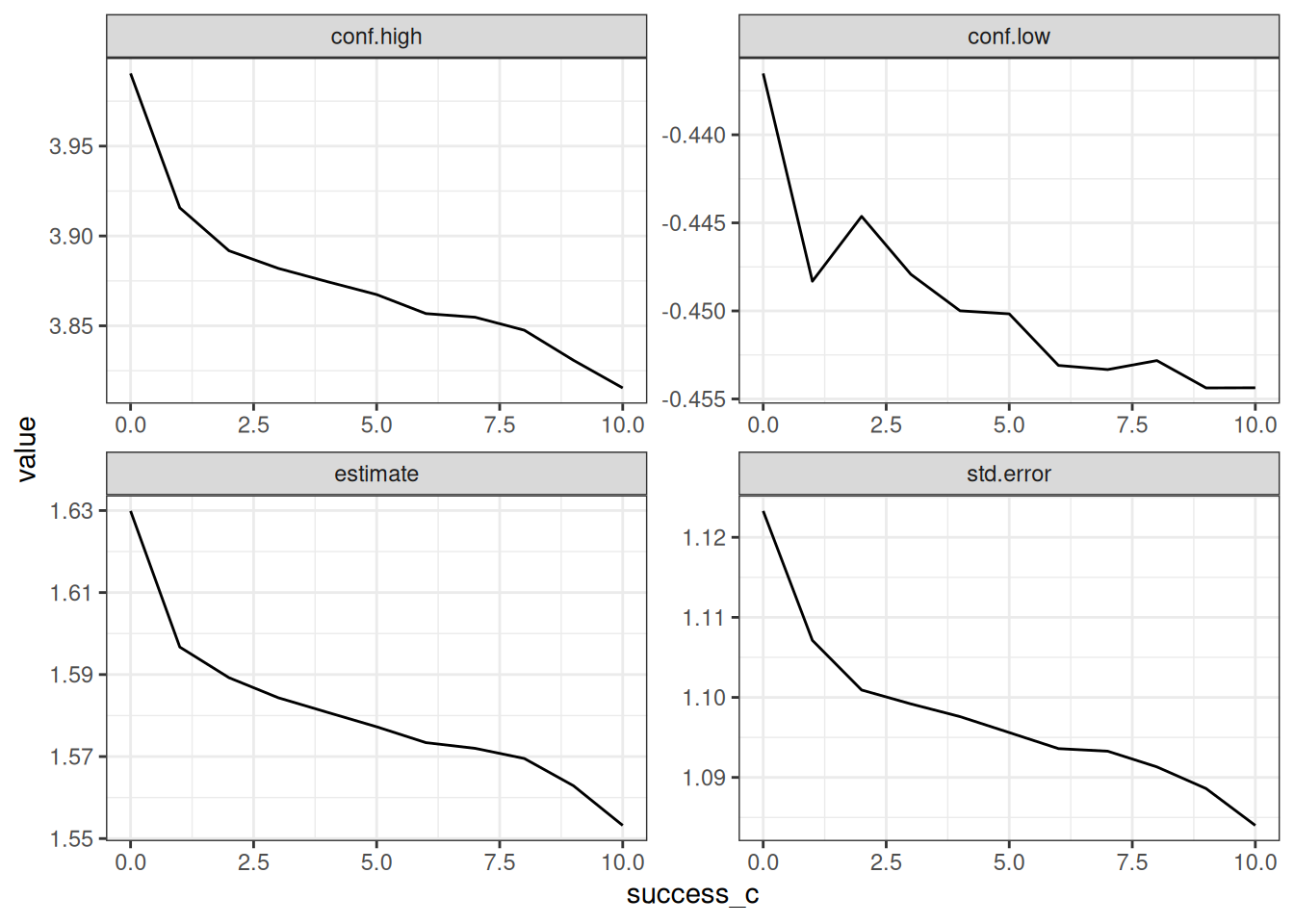
# GLM has issues fitting when 0 or 10 successes in Arm C
out_glm <- mod_definitions |>
  subset(success_c > 0 & success_c < 10)

all_glm_mods <- out_glm |>
  purrr::pmap(make_data) |>
  purrr::map(function(.d) {
    glm(outcome ~ arm, data = .d, family = binomial) |>
      broom::tidy(conf.int = TRUE)
  }) |>
  purrr::map(
    function(.d) dplyr::select(.d, term, estimate, std.error, conf.low, conf.high)
  )

out_glm$x <- all_glm_mods
out_glm <- out_glm |> tidyr::unnest(x)
out_glm |>
tidyr::pivot_longer(c(estimate, std.error, conf.low, conf.high)) |>
dplyr::filter(term == "armB") |>
ggplot(aes(x = success_c, y = value)) +
geom_line() +
facet_wrap(~name, scales = "free")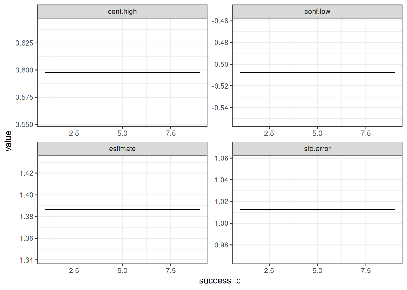
Discussion
It’s not entirely clear what is to be done about this situation. I don’t think it’s ideal because you shouldn’t have to fit a sub-model, excluding one arm’s data in order to get consistent effects for the other arm.
In general, one of my favorite parts of Bayesian analysis is the ability to define the precise structure of the parameters and how they should affect each other. Unfortunately, this example shows that there may be hidden correlations that are surprising.
Next Steps
An obvious next step would be to confirm that this happens outside of brms. While I did some light confirmation with rJAGS I’m not familiar enough with it to feel like I kicked the tires enough. I could write more specific bespoke code for Stan, but it’s unclear if this is a Stan issue or not.